In a crowded world of full-service agencies who say they can do it all, Good Humans do one thing, and we do it brilliantly. We rollout.
We do good work for.... OUR CLIENTS


GOOD ROLLOUTS
You have a brand that you care deeply
about and you want to make
more famous, while ensuring
that every touchpoint keeps the
same spirit as the original idea.
We want the same thing for you.
GOOD ARTWORK
We care about the craft of what we do.
We have a proven process to ensure that
every adapt builds on your campaigns and
connects to your wider brand.
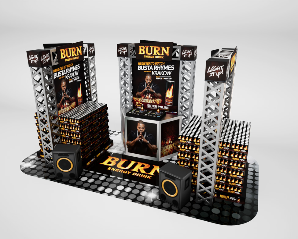
GOOD ACTIVATIONS
Our experience speaks for itself.
Every year we produce tens of thousands
of artworks, in multiple shapes and formats,
to multiple territories across the world.
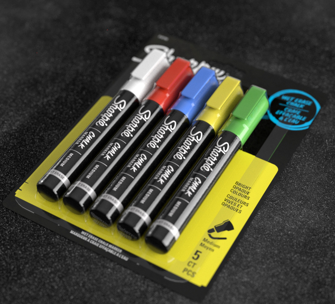
GOOD VISUALISATIONS
We create vividly alive product
prototypes, in-store mock-ups and
hyper-realistic picture-perfect
shots to show your ideas in
the best possible light.